How can festival attendees explore Polish heritage through a more engaging digital experience?
Muskegon Polish Festival Mobile & Tablet Experience
Education
A festival-focused digital experience that introduces the event, shares Polish heritage, and gives attendees a smoother path through the most important information. It starts with a mobile quiz and leads into a tablet journey with interactive maps and layered cultural content. I was a UX engineer and frontend developer on a five-person team, and I owned the tablet timeline from start to finish.


Role
UX Engineer & Frontend Developer
Timeline
January 2026 - May 2026
Stack & Methods
Development
Design & Research
Overview
Problem Statement
Historical information was often presented through static posters that were hard to access, making it difficult for younger visitors to connect with the festival’s cultural depth and causing important heritage context to get lost in the event’s noise.
Solution
- Designed a connected cross-device experience that starts with a mobile quiz and leads into a tablet journey with interactive maps and layered cultural content.
- Linked playful interaction with deeper exploration so cultural learning feels more intuitive, memorable, and meaningful across generations.
Experience Flow

The Result
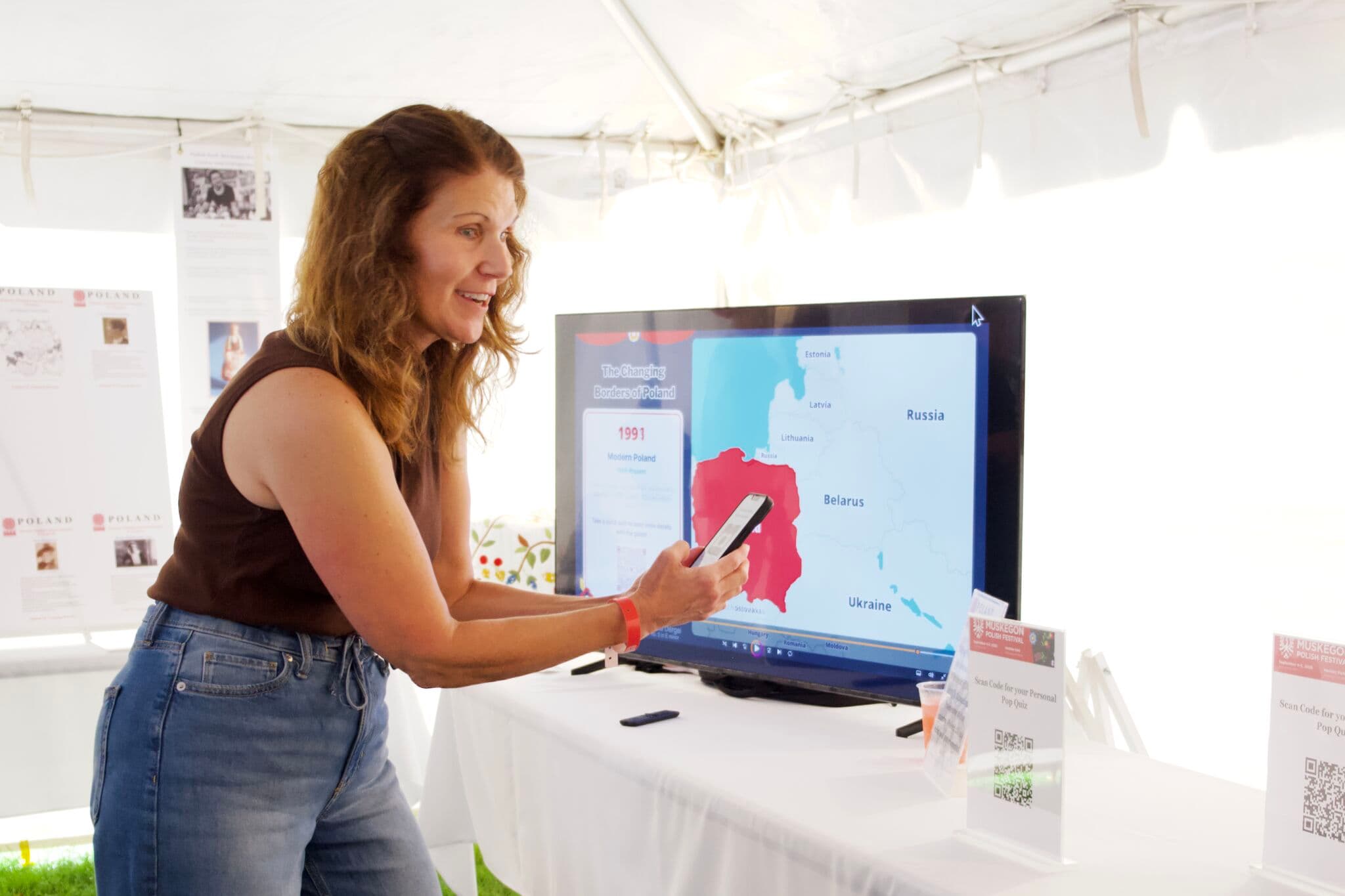
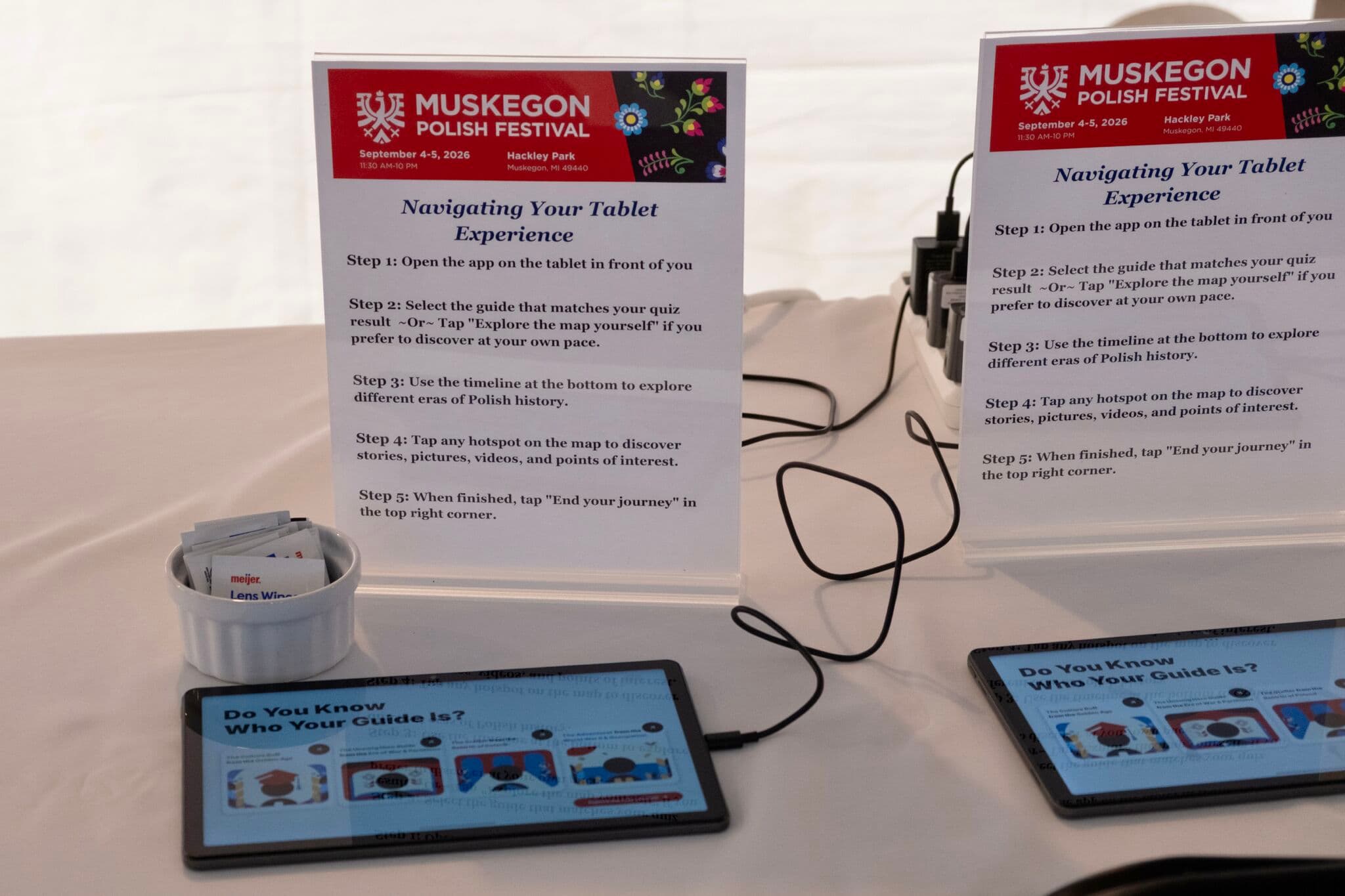
Left image shows a user scanning the QR code to begin the Mobile Guide Experience. Right image displays the initial screen and steps of the Tablet Experience.
Demo
Loading video...
Loading video...
Loading video...
Loading video...
My Work
Historical information at the Muskegon Polish Festival was often presented through static posters that were hard to access, making it difficult for younger visitors to connect with the festival's cultural depth. Younger visitors came mostly for the food and music, so history was getting lost in the noise. For our client, it was also a memorial project for their father. Our team inherited Figma designs from a previous design team and designed a connected cross-device experience with two parts: a five-question mobile quiz that visitors reach by QR code while waiting in line, which matches them to a "Polish history guide," and an interactive timeline and map on the festival's Android tablets that the guide shapes. We demoed our work to the client every two weeks at the end of each sprint, and their vision grew over the project from basic utility toward high-impact immersion.
I focused mainly on the tablet experience, with some work on the mobile version, and I owned the tablet timeline and map page from start to finish. Smoothing out the timeline was one of our client's top priorities at kickoff. The design prototype felt jerky, it split history across four separate sliders that you clicked through with arrows, and it spaced years evenly even though the gaps between them varied. Working from our design meeting with the original designers, I replaced the four sliders with one continuous slider and built the timeline component so users can drag through the experience with an easy, fluid motion, keeping arrows to change which range of years is shown. I also spaced the years proportionally so the distance between them reflects how much time actually passed. The team counted that proportional timeline as one of our breakthroughs. I created the tablet timeline and map page with the year, era, border changes, hotspots, and event descriptions, and linked each point on the timeline to deeper content pages that expand on key moments in Polish history. When I first demoed the timeline, our client loved it.
A lot of my work was about building for people who would never touch the code. Our client plans to hire a content writer to fill in the exact events and historical details, so I built the timeline as a flexible content template with a basic starting idea rather than a finished set of information. When era descriptions were missing, I flagged them to the client and kept placeholders in place so development could keep moving. I also turned the team's UI/UX mockups into usable frontend components for the tablet app, with color schemes that support readability and contrast while keeping the experience welcoming. To work in parallel without breaking each other's code, our team built shared global styles first, split the app into modular components, and paired every pull request with a merge partner for review.
The sprint reviews shaped a lot of my thinking. When the team discussed adding a timer to end each visitor's journey, I raised a concern about putting time pressure on visitors and suggested a simple reset option that festival staff could use to start the experience over for the next person. Our client worried a button would add clutter, which led to the idea of a small reload icon on the guide page instead. I also suggested pairing the popup that appears when a visitor starts their guide with a help button that brings the same information back up later. Working on a touch device taught me how precious screen space is, since every element on screen had to earn its place.
The biggest lesson from the project was about cohesion. We followed our Figma designs closely, and the quiz and the timeline map each worked well on their own, but late in development both our team and our client felt something was missing: they felt like two separate tools. My teammates added transition pages, a guide reveal, and an onboarding step into the map, and our client was thrilled with the result. Seeing that change taught me that cohesion matters as much as any individual screen, and that not limiting ourselves to the original design is what brought the project to life.
Outcome
Over five sprints, our team completed 313 story points across 88 tasks and delivered both halves of the experience. The mobile quiz runs as a web app on Vercel that visitors reach by scanning a QR code, and the tablet experience installs directly onto the festival's Android tablets through Expo, without going through the Play Store. Because the app will keep running after our team is gone, we also handed off a step-by-step maintenance guide that lets the festival's non-technical team and a future tech intern update quiz questions, guides, timeline years, maps, and content without rewriting the app.
Our client loved the timeline and was thrilled with the final, connected experience. The project won the Final Project Award for User-Centered Agile Development at the UMSI Exposition for "Cultural and Educational Interactive Experience for Polish Festival Visitors," and it is set to debut at the Muskegon Polish Festival in September 2026.

Team: Samantha Pratt, Boran Yang, Xiwen Cao, Siraaj Kudtarkar, Jonte Taffe (not pictured)
SI 699 User-Centered Agile Development Mastery Course
The experience was received very well by those who used the tablets. Feedback from the festival included "Amazing," "I've never seen anything like this before," "Really cool," and "That was something!" Visitors also suggested changes: "Get rid of ads on the videos," "The timeline makes it cumbersome to find what I was looking for," and "Can I keep this experience?" We also saw that attendees were intimidated by the quiz, since many were afraid they needed to know Polish historical trivia.
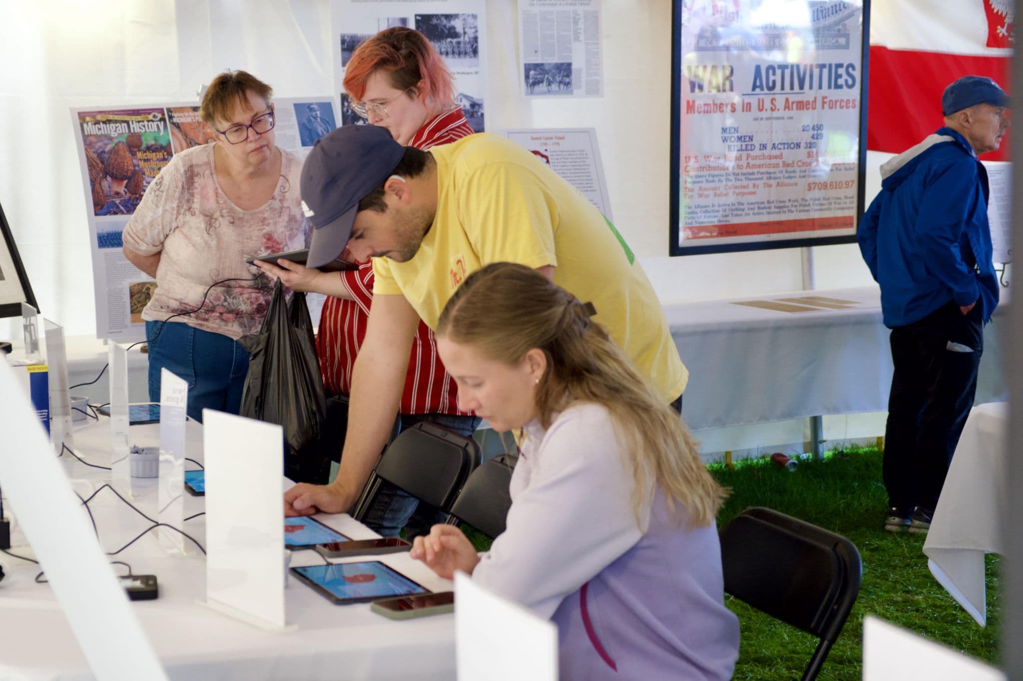
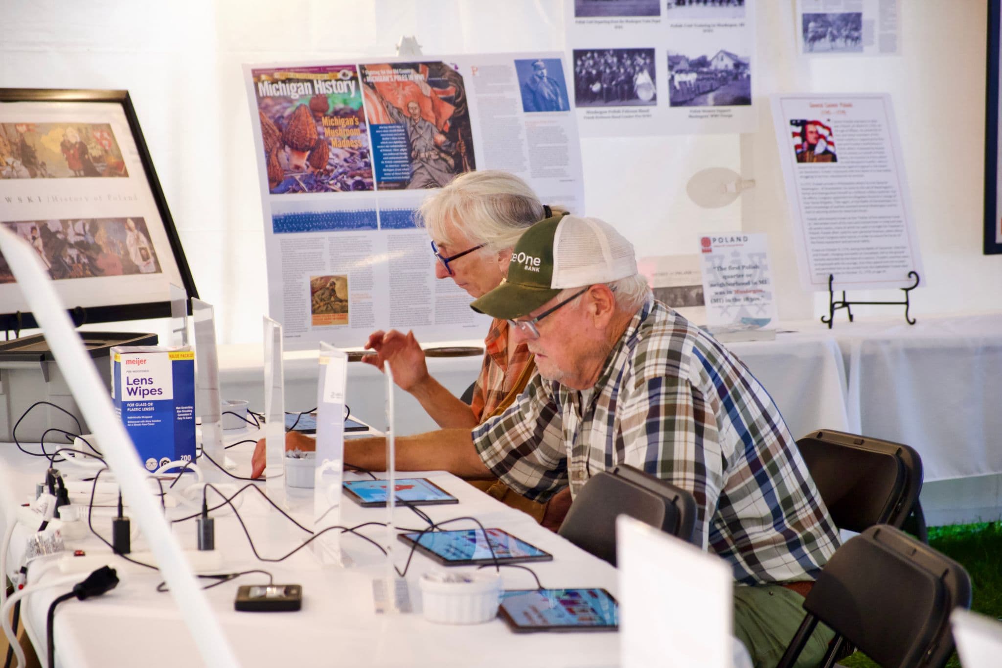
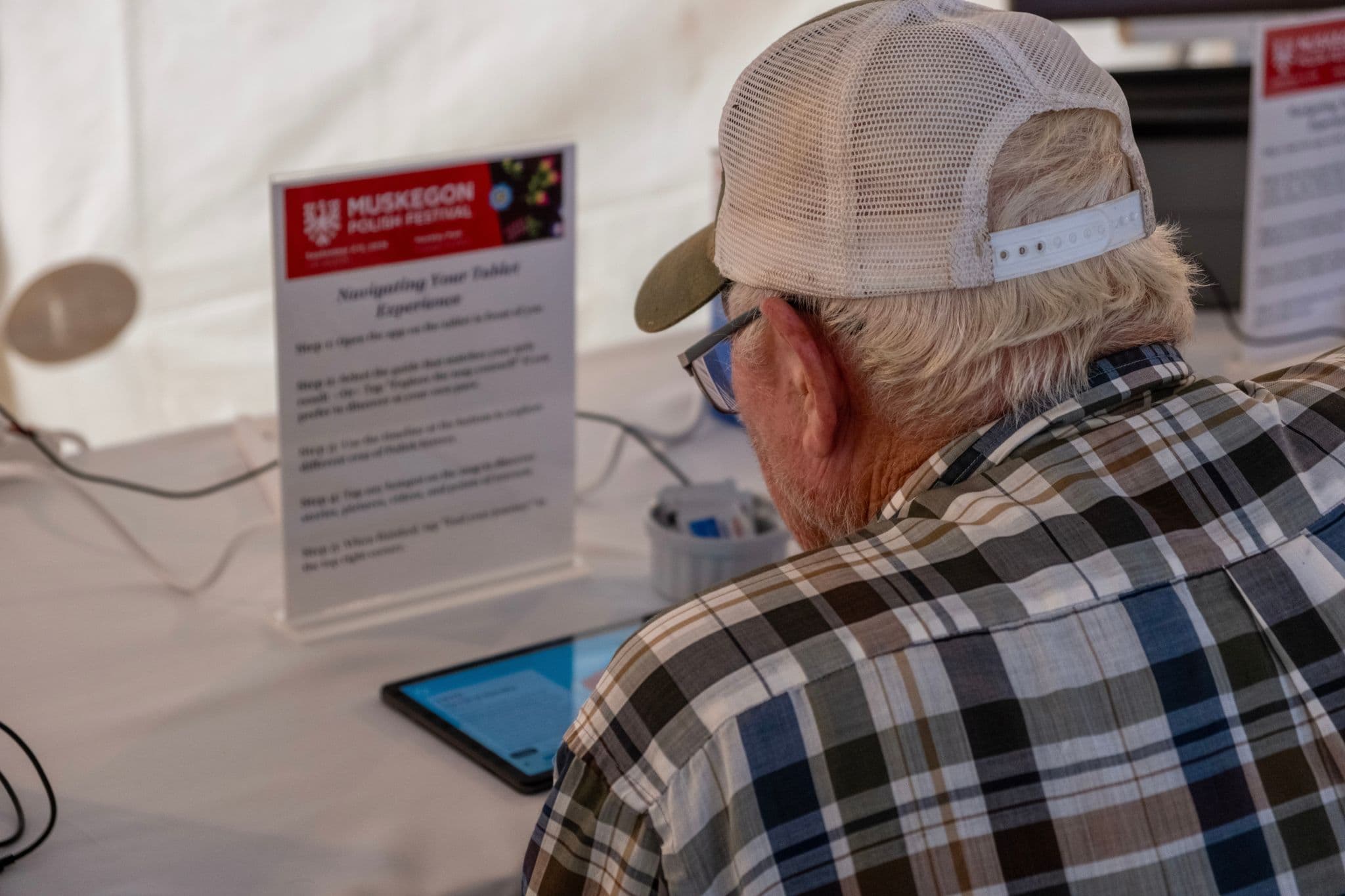
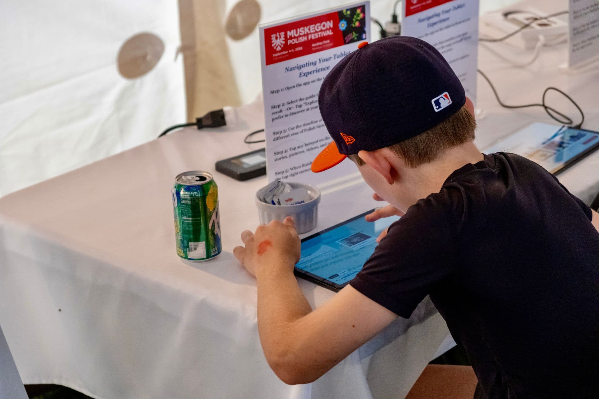
Visitors of all ages at the Muskegon Polish Festival engaged with the Tablet Experience!