How can students see in real time whether they are actually following their exam prep plan?
The Final Buzzer
Education
A React web app that helps students prep for exams with a real-time countdown and a dashboard that compares planned versus actual study time. This project focuses on behavior change: students get constant visual feedback on whether they are executing their plan. I built it on my own for one course, then ran a full accessibility audit on it for a second course.
Role
Frontend React Developer
Timeline
February 2025 - April 2025
Stack & Methods
Development
Design & Research
Demo
Loading video...
My Work
The project started from one question: how can students see in real time whether they are actually following their exam prep plan? I wanted one project to satisfy two courses: SI 579, which asked for an interactive JavaScript application, and SI 539, which focused on accessibility audits and semantic HTML. The Final Buzzer became both, built for university students who want a visual reminder of their exam deadline and a structured way to track their time, including students who rely on keyboard navigation or screen readers.
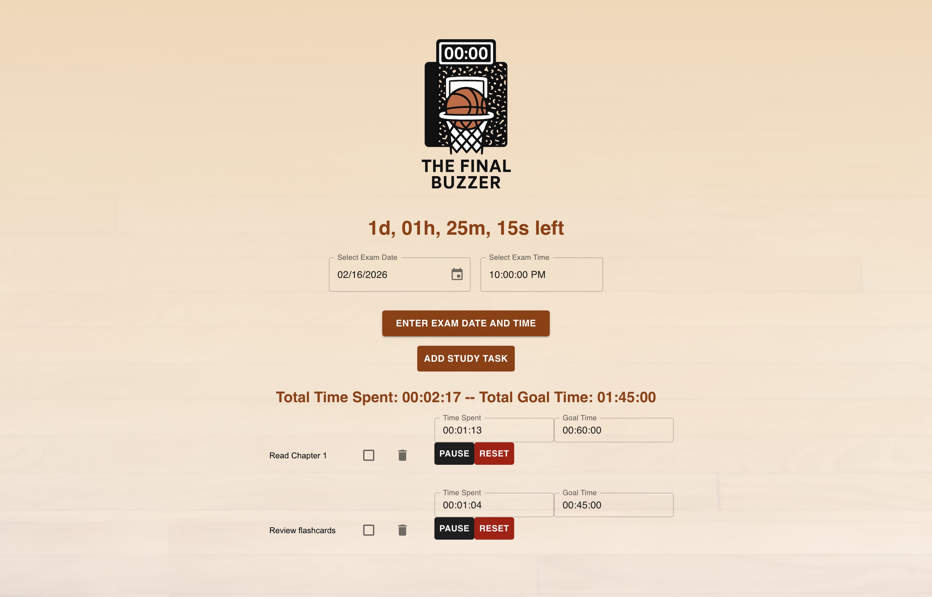
For SI 579, I built a real time loop so students can compare plan versus actual effort instantly. I shipped the countdown timer, task CRUD, and time tracking controls. A large exam countdown shows the days, hours, and minutes left and updates in real time, students can add, edit, and delete study tasks with a planned time estimate, and every task has Record and Stop buttons that log the actual time spent with timestamps. I added local persistence to preserve study history across sessions and built a dashboard that summarizes workload and real progress, showing each task's planned versus actual time and the total time studied. I deployed the finished app on GitHub Pages.
For SI 539, I ran an in-depth accessibility audit of the deployed site using WAVE, axe DevTools, and Chrome, along with manual testing through VoiceOver and keyboard-only navigation. The audit uncovered real problems. VoiceOver could not read anything beyond the logo, and I could not reach everything with just a keyboard, because the page was missing the tab order needed for navigation. The task time fields were missing labels and ARIA attributes, the checkbox and delete icon were nested inside another interactive control, a list used a div instead of a proper list item, and on mobile the button and timer text was too small. Color contrast and image alt text passed.
The hardest part was understanding how React interacts with accessibility standards. Unlike static HTML, React builds the page dynamically through JavaScript components, so some problems were not visible until I tested with assistive technology. I spent most of my time researching accessible React development, especially how attributes like aria-label work in components, and then testing my changes by hand. Over the last two weeks of the project, I put in about 19 hours, working through aria-labels, keyboard navigation, VoiceOver support, color contrast, and mobile layout testing. That hands-on testing showed me firsthand the barriers users face and how technical changes translate into real-world usability.
Outcome
I shipped timer and workload workflows that convert intention into measurable execution, from planning to time tracking, with the app live on GitHub Pages. I then used my audit to improve labels and structure for assistive technology support, validated keyboard navigation and baseline screen reader behavior, and tested color contrast and the mobile layout. The site is more accessible but not fully accessible yet, and the audit gives me a clear, documented list of what remains. The project strengthened my real time state management and timer architecture and improved how I design for accessibility while shipping quickly.